Victoria’s Secret Sport
Challenge
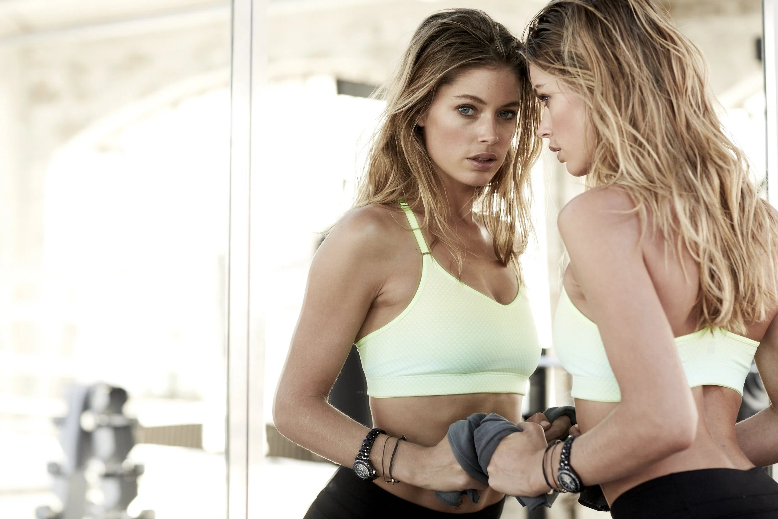
As a global leader in lingerie, Victoria’s Secret set out to expand into performance-driven sports apparel—entering a highly competitive category dominated by brands built exclusively around athletic identity. VS Sport required a distinct visual language that could stand on its own, appeal to a performance-minded customer, and command attention alongside established leaders like Lululemon and Athleta. The existing brand system lacked the strength, clarity, and edge needed to compete in this space across digital and print platforms.
Approach
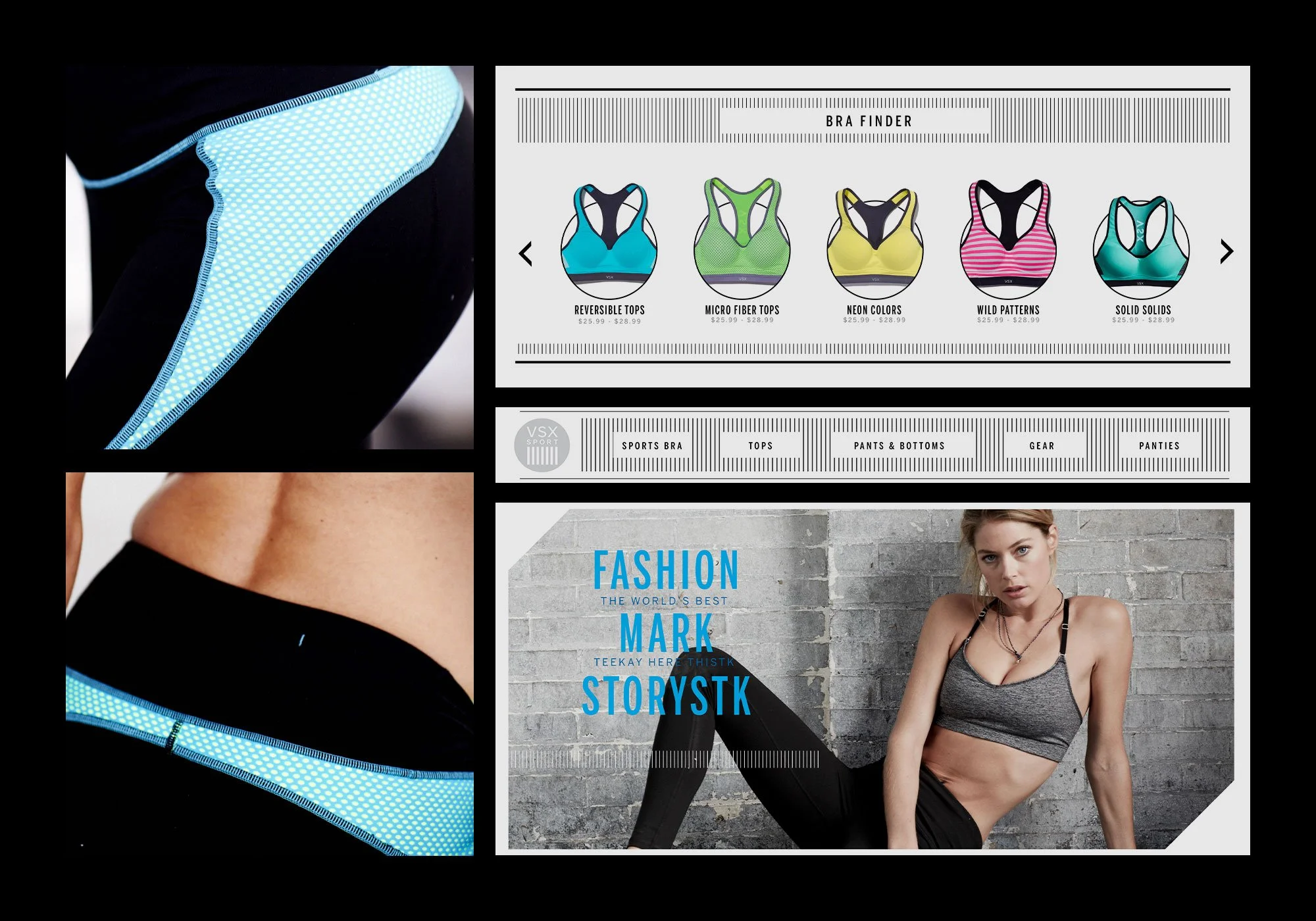
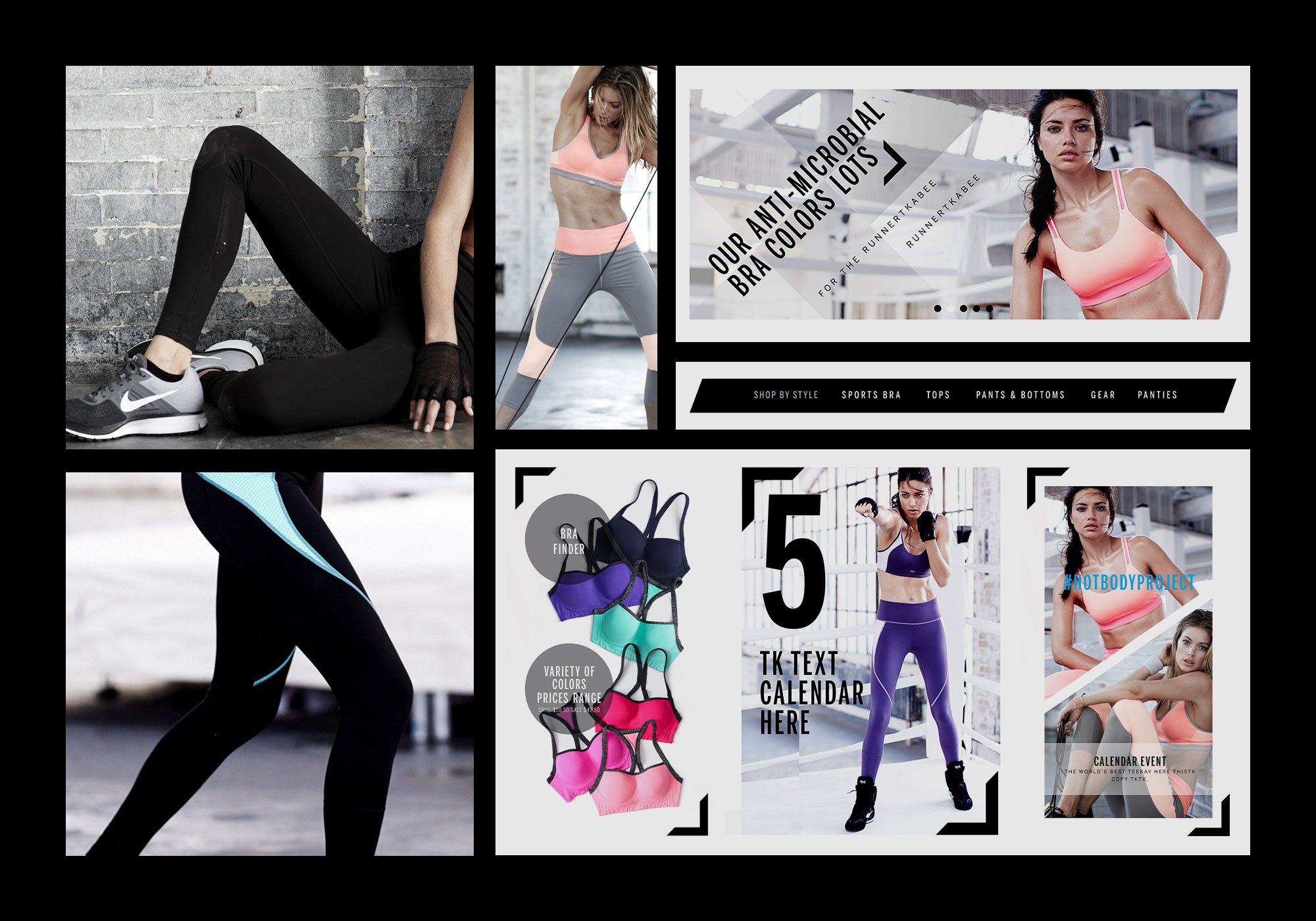
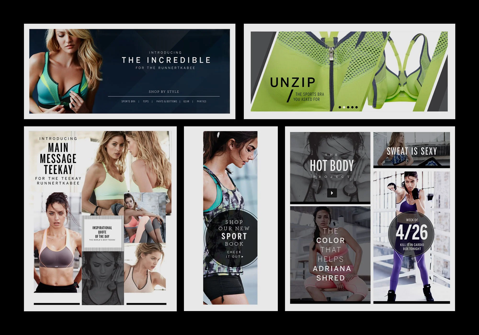
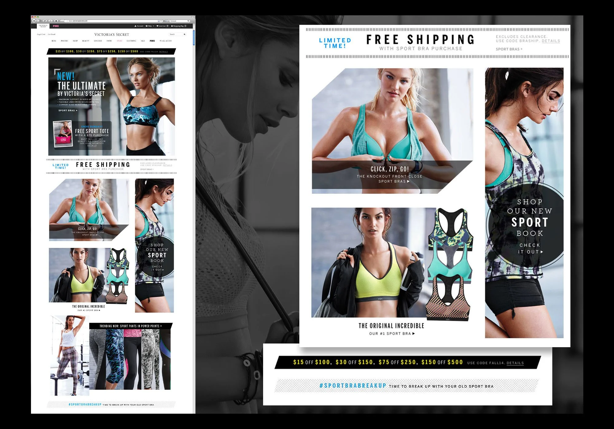
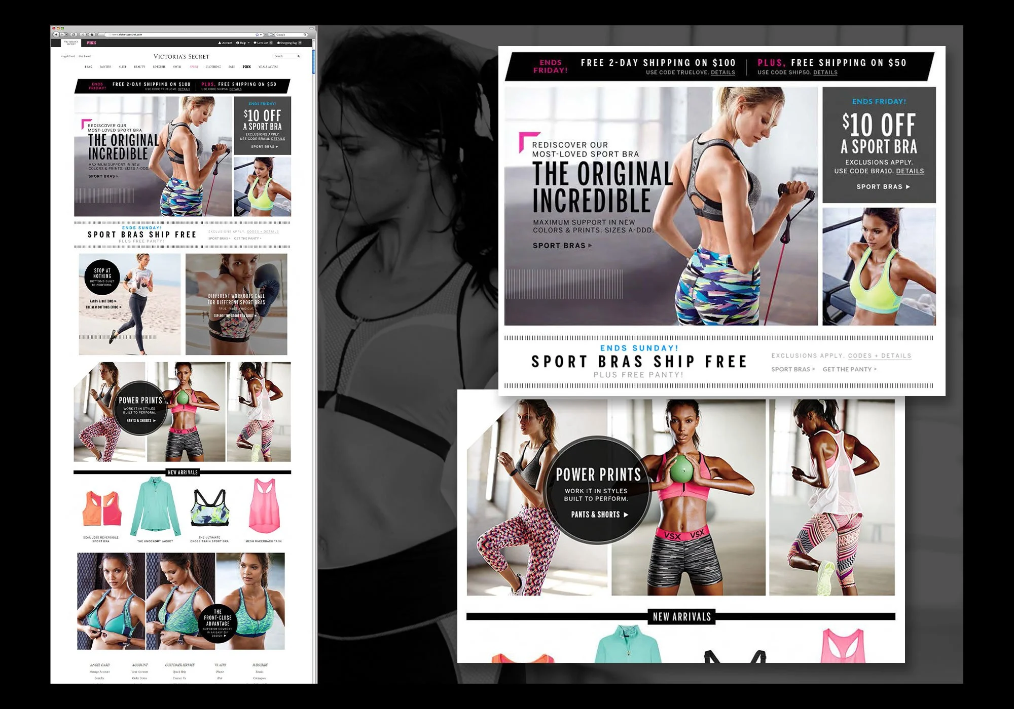
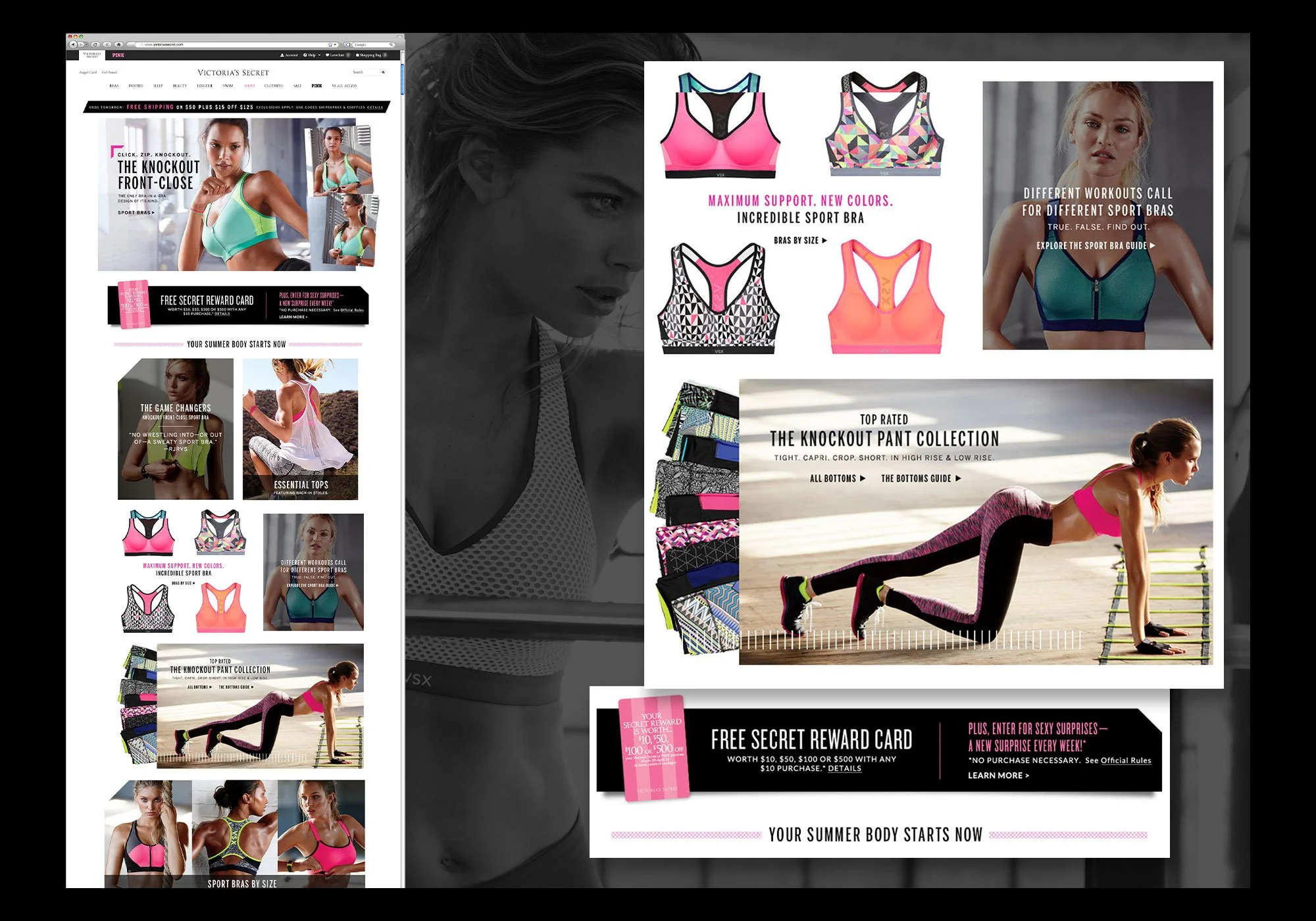
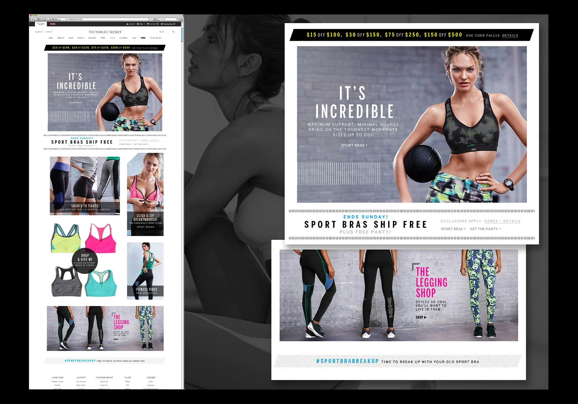
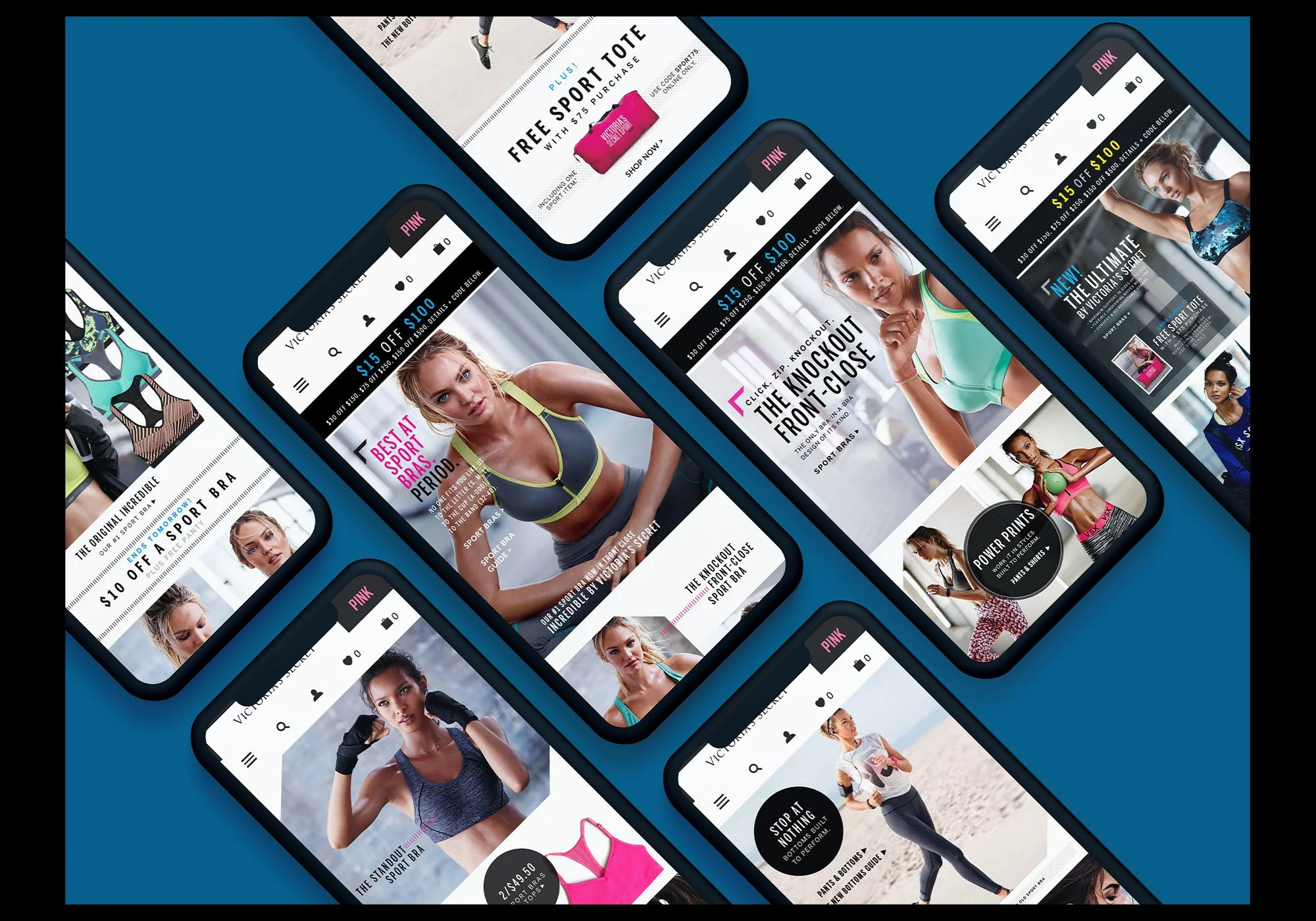
Working collaboratively across design and product teams, we developed a bold, aggressive visual direction tailored specifically for VS Sport. The system was built around strong typographic hierarchy, pronounced graphic elements, staggered grids, and asymmetrical compositions that conveyed energy, movement, and confidence. A restrained, muted palette provided structure, while strategic bursts of vibrant color—pulled directly from the garments themselves—created a dynamic and ownable color harmony. This visual language was applied consistently across the global website, mobile experience, and print catalogs, ensuring a cohesive yet high-impact brand presence.
Outcome
The resulting identity established VS Sport as a confident, visually distinct player in the athletic apparel category. The new system elevated the brand’s digital and print presence, sharpened its competitive edge, and enabled Victoria’s Secret to connect more authentically with a performance-focused audience. By giving VS Sport a visual voice of its own, the brand successfully expanded beyond its heritage and asserted itself in a crowded, fast-moving market.