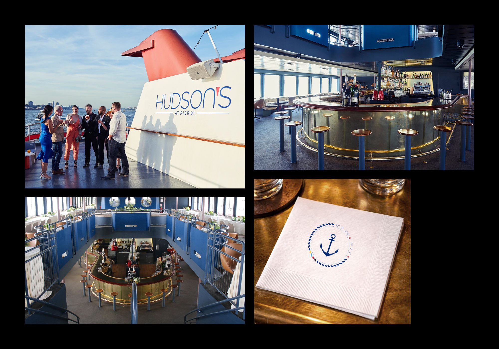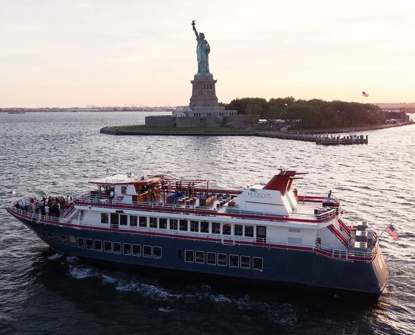
Hudson’s Dining Cruise
As a newly launched dining experience within the portfolio of New York Cruise Lines, Hudson’s entered the market without a defined brand system. With multiple partner agencies and vendors producing assets across print, digital, and out-of-home, the absence of clear brand guidance created inconsistency across guest touchpoints. The challenge was to establish a cohesive, premium identity that reflected the elevated onboard experience—four-course dining, creative cocktails, and sweeping skyline views—while clearly differentiating Hudson’s from more tourist-oriented marine dining competitors.
Approach
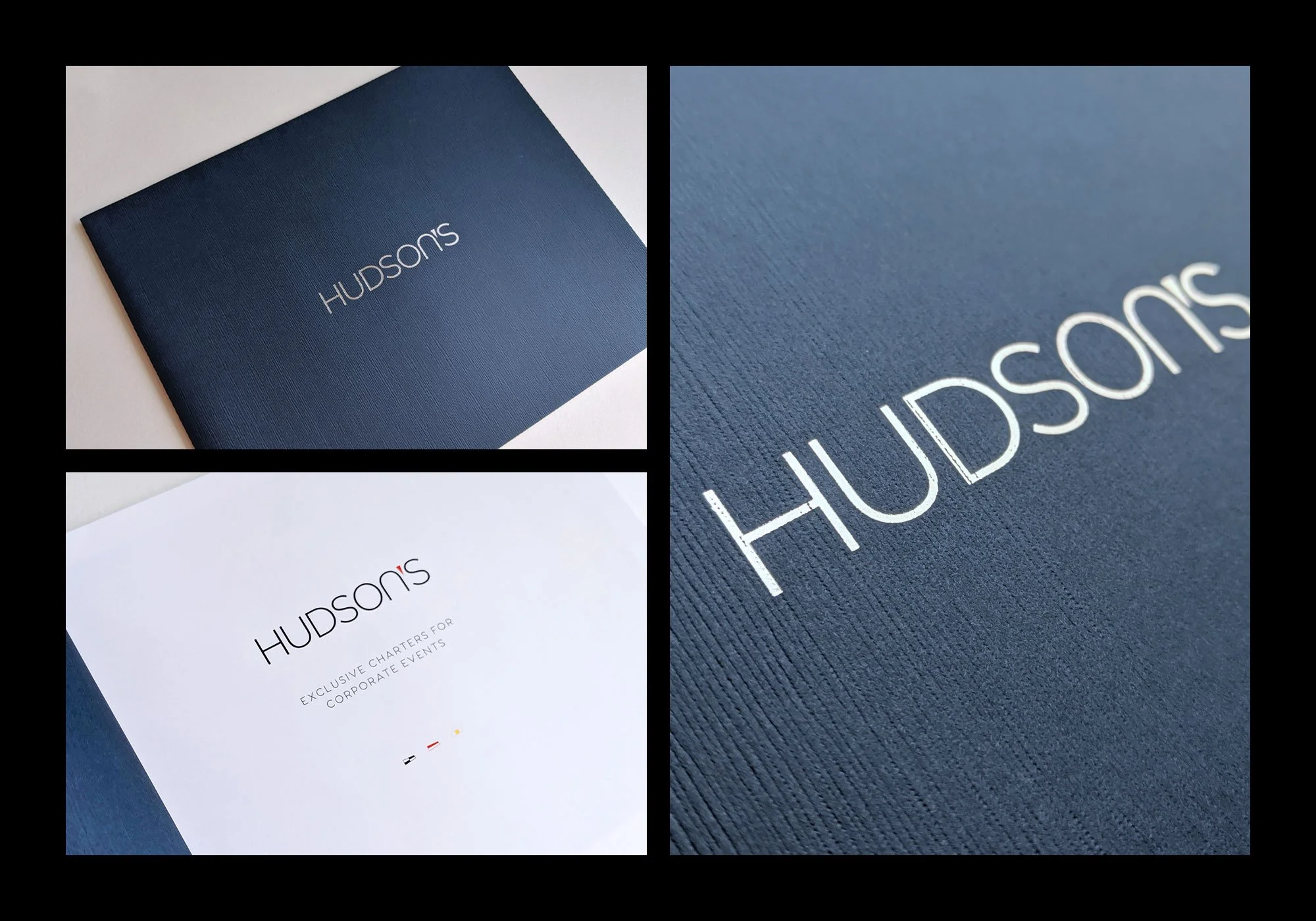
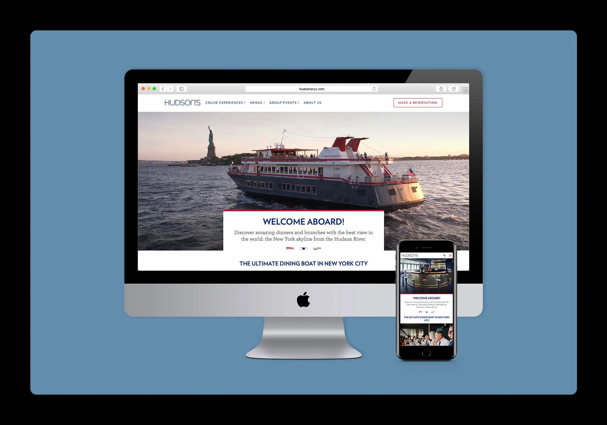
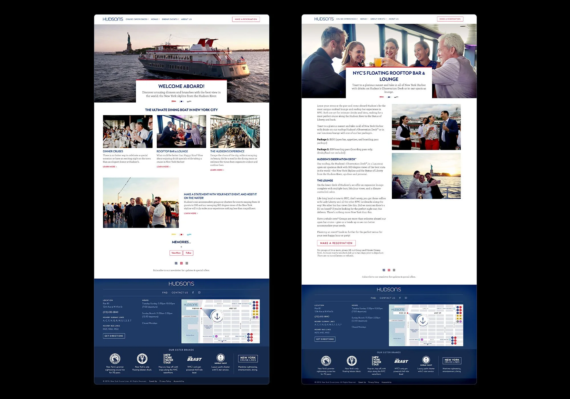
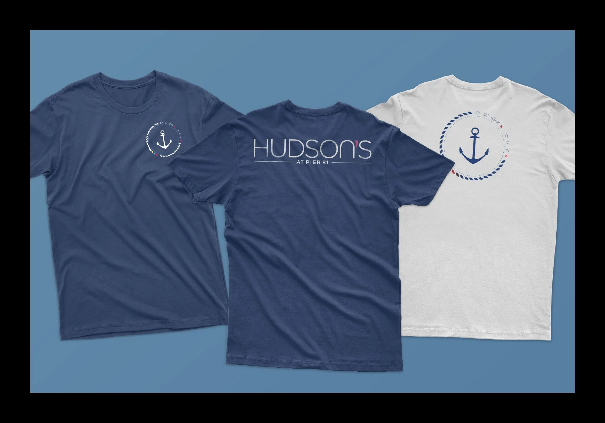
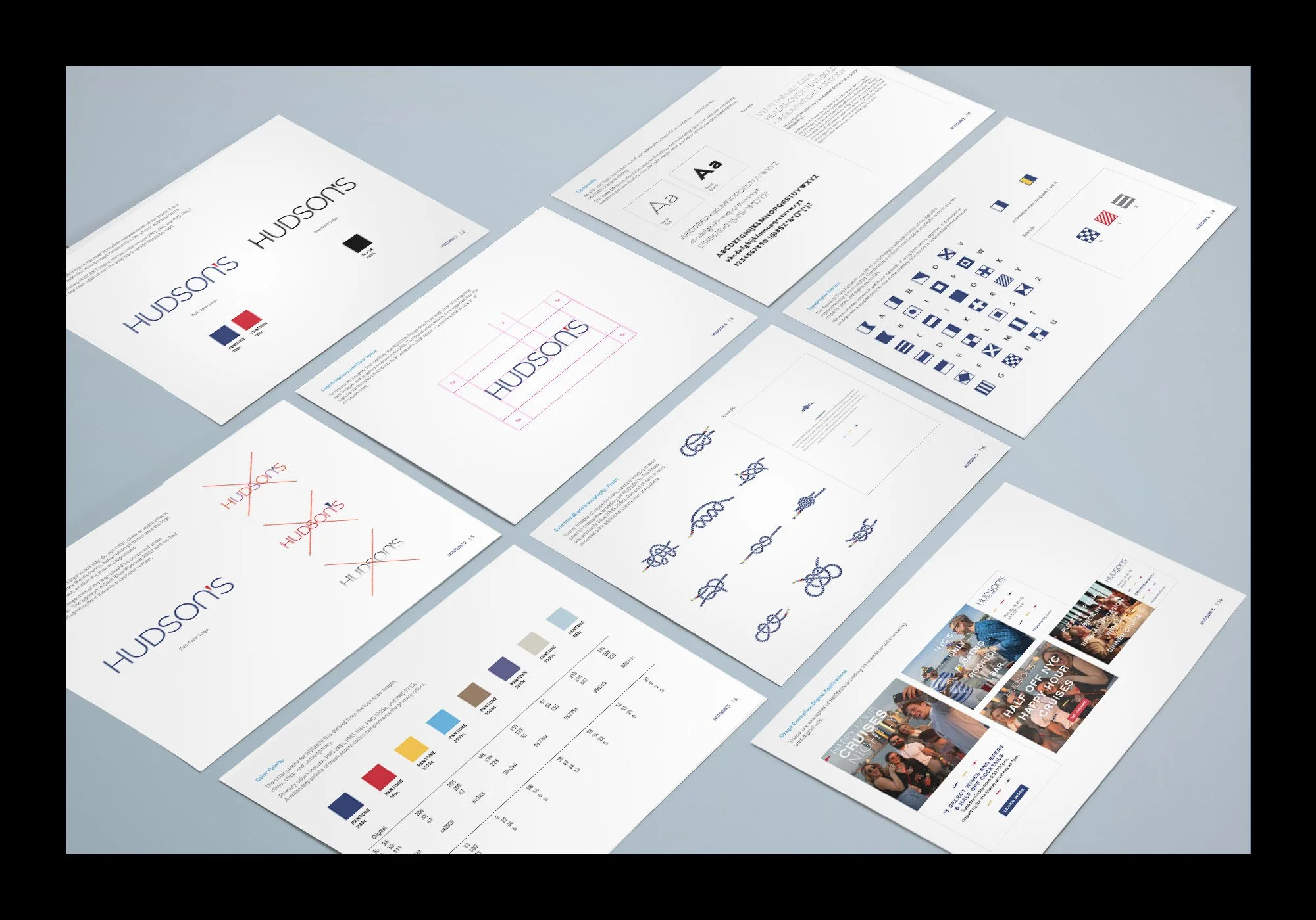
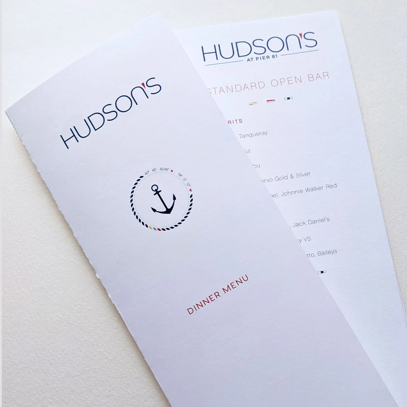
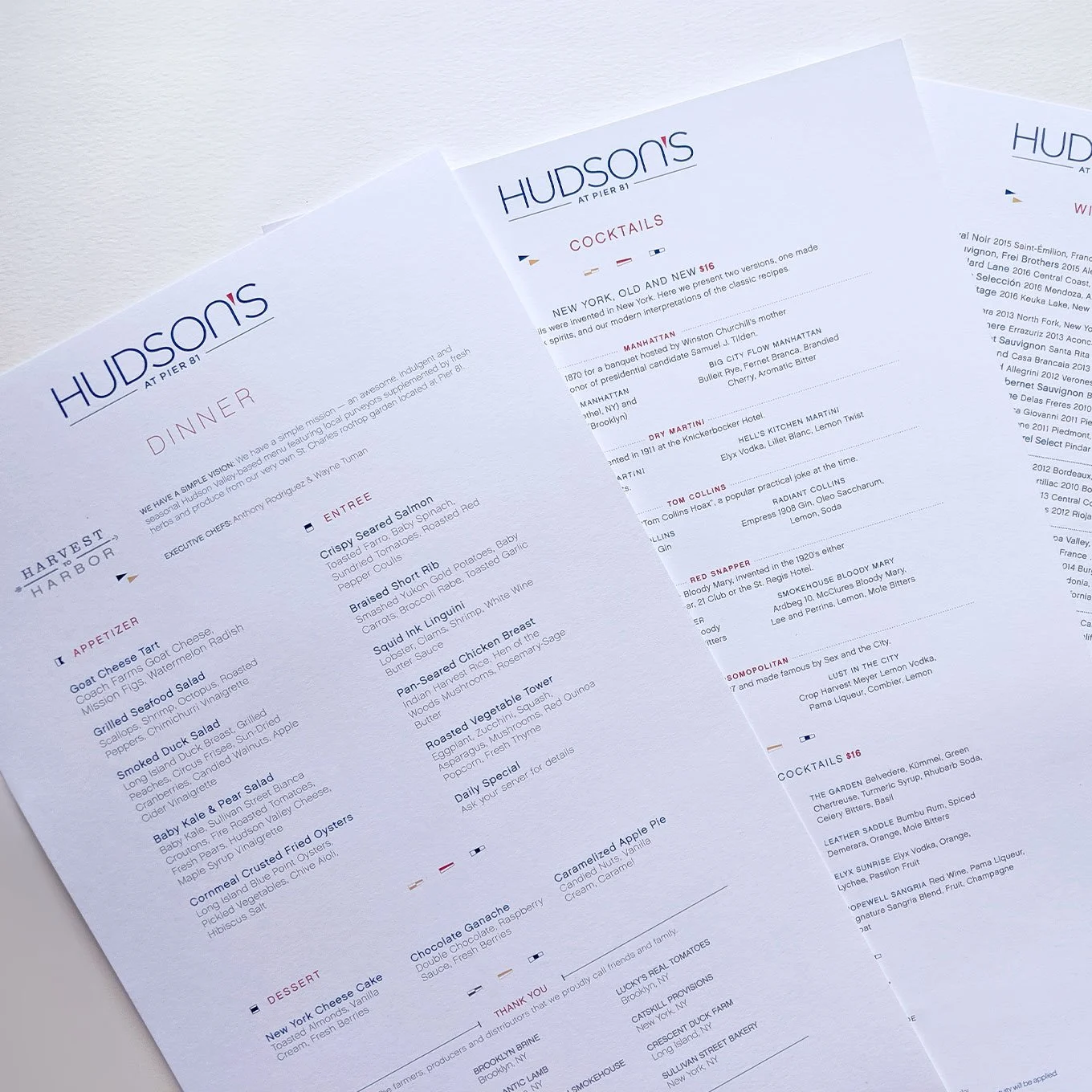
We developed a comprehensive brand system designed to unify Hudson’s across all channels and partners. At the core was a clear set of brand guidelines defining typography, color, iconography, layout principles, and photography direction—ensuring consistency without sacrificing flexibility.
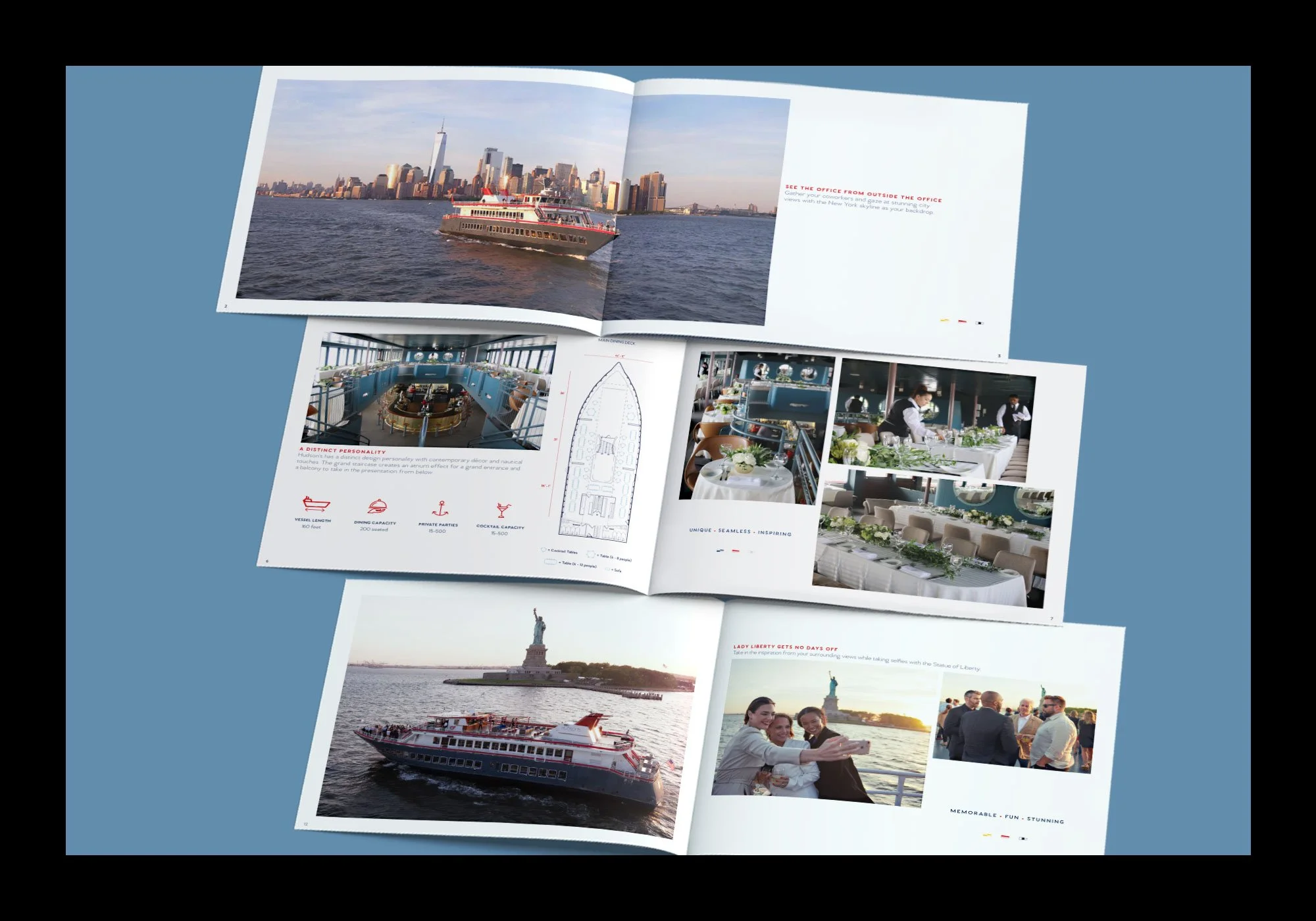
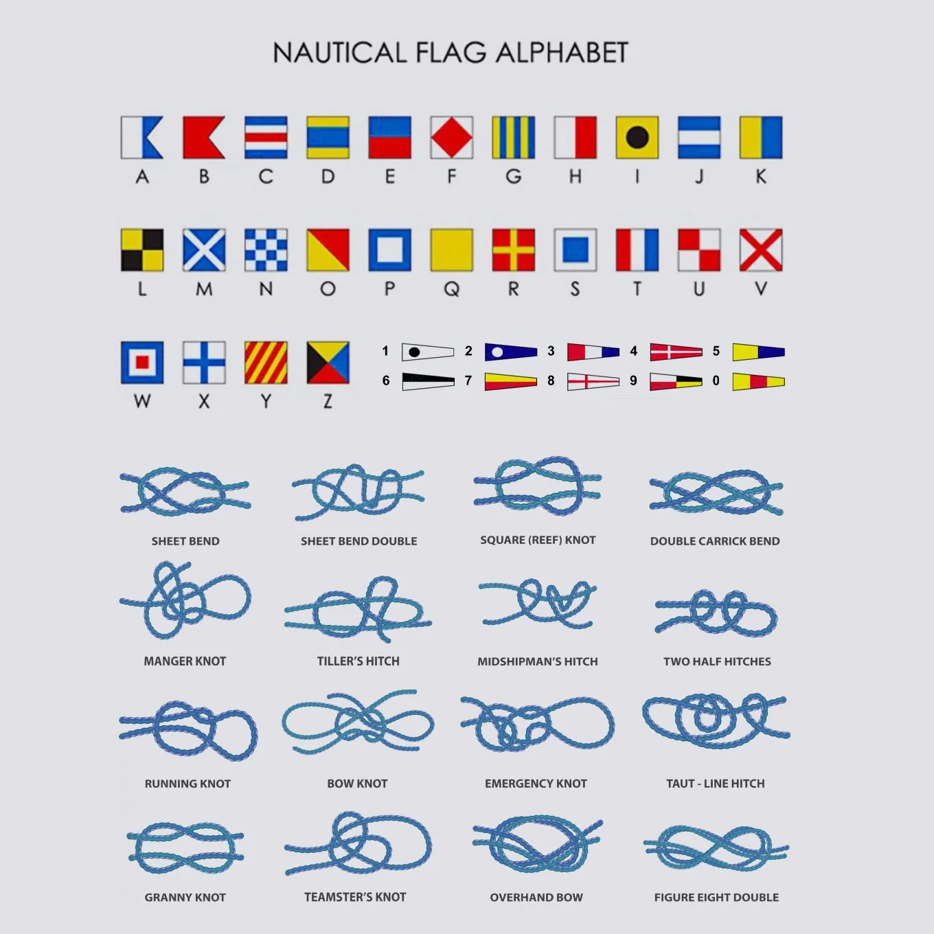
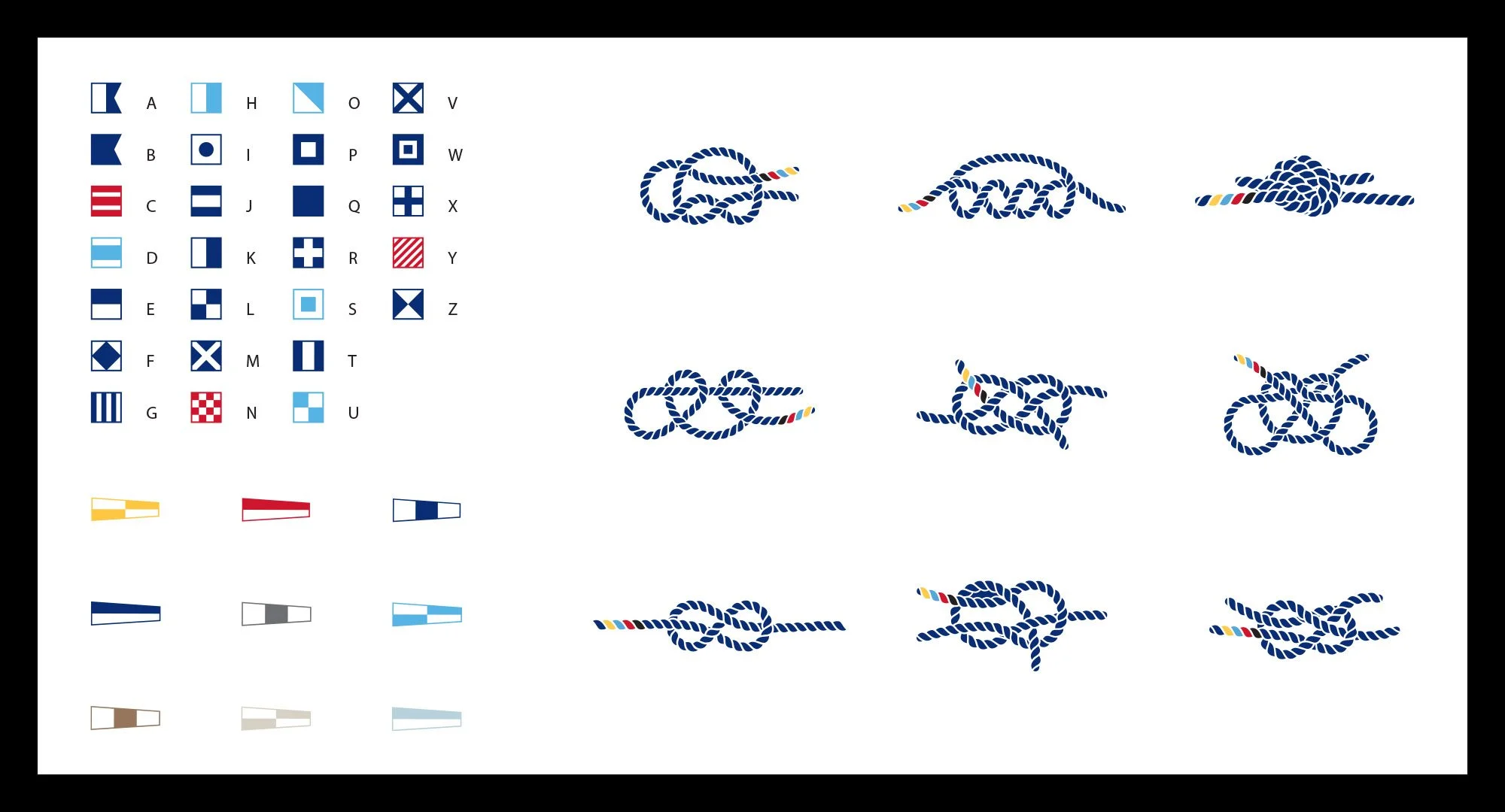
Visually, the identity drew inspiration from classic nautical flag alphabets, numeral pennants, and sailor’s knots translating their graphic clarity and modular forms into a modern, refined design language. These cues were paired with bold typography, confident color usage, and in-house photography that emphasized ambiance, cuisine, and the iconic New York City skyline. The result was a visual system that felt unmistakably maritime yet sophisticated, contemporary, and distinct from traditional cruise branding.
Outcome
The new brand program unified Hudson’s presence across onboard materials, digital platforms, and out-of-home executions, creating a seamless and elevated guest experience. With a clear and ownable visual identity in place, Hudson’s was positioned as a premium dining destination on the water—modern, design-forward, and experience-driven. The system streamlined collaboration across vendors while elevating the brand above competitors in the marine dining category, reinforcing Hudson’s as a standout offering within the New York City dining landscape.